Описание бренда
Для данного проекта был выбран ребрендинг кафе арабской кухни «Аполлон». Это заведение с высоким качеством продукта и аутентичной кухней, но с отсутствием выстроенной визуальной системы и низкой узнаваемостью, из-за чего кафе стало невидимым для новой аудитории.
Нынешний логотип и дизайн меню
Помимо факторов, связанных с отсутствием узнаваемости заведения, на такой выбор повлияла личная связь с кафе, поскольку оно стало излюбленным местом для встреч с друзьями и семьей, и хотелось бы, чтобы об этом заведении узнали люди.
Это заведение заслуживает ребрендинга, поскольку оно является проходным, людным местом.
Позиционирование
«Аполлон» — это локальное аутентичное кафе арабской кухни, известное среди студентов и постоянных клиентов как скрытая точка с щедрыми порциями, тёплой уютной атмосферой, а также вкусом блюд. Для бренда важно дать посетителю качественный гастрономический опыт от посещения, бренд строится не на внешнем визуальном образе, а на содержании.
Бренд строится на нескольких чётких смысловых акцентах.
(1) Аутентичность без адаптации под массового потребителя
(2) Скрытая ценность, ведь лучшие места не всегда заметны с первого взгляда
(3) Заведение как пространство общения с домашней, живой атмосферой
Целевая аудитория
Ввиду непосредственной близости заведения к РУДН, основу целевой аудитории составляют студенты и молодые люди 18–25 лет, для которых важно находить неочевидные, скрытые места.
Также частью аудитории являются и постоянные посетители, которым важно сохранить ощущение знакомого пространства и привычной атмосферы
Дополнительно бренд может быть интересен людям, которые ищут нетривиальные гастрономические точки и формируют маршруты через рекомендации и личный опыт.
Концепция ребрендинга
Название заведения не будет подлежать изменению, но оно требует обоснования. Аполлон — бог солнца, поэтому название переосмысляется как метафора внутреннего света, скрытого тепла и энергии. Это работает и для самого места, которое раскрывается тем, кто его находит.
Таким образом, здесь Аполлон это солнце, которое ты находишь внутри, это свет, который нужно найти.
Айдентика
Новый логотип кафе
Новая палитра бренда
В качестве основного шрифта проекта был выбран шрифт Manrope. Он спокойный, геометричный, нейтральный, ввиду чего он не отвлекает от логотипа.
Промо-материалы
Рекламные плакаты
Входная группа кафе
Носители
Пакет и коробка для подарочных наборов или еды навынос
Стикеры
Меню и упаковка с едой
Бумажные стаканчики и салфетки
Описание процесса ребрендинга
Процесс работы строился на поэтапном использовании генеративных моделей с контролируемыми итерациями. На первом этапе были сформулированы точные текстовые промпты с жёсткими ограничениями по композиции, цветовой палитре и типографике, а также с привязкой к изображениям.
Далее выполнялась серия генераций с последующим ручным отбором наиболее релевантных результатов. Ключевой принцип — не финализировать изображение за одну итерацию, а использовать цепочку уточняющих промптов: корректировка композиции, замена визуального стиля, локальные правки отдельных элементов без пересборки всей сцены.
На финальном этапе отобранные изображения приводились к единой системе через унификацию параметров (цвет, плотность орнамента, масштаб элементов), что позволило собрать консистентную серию носителей без потери вариативности.
Использованные нейросети
Промпты для генерации айдентики
Промпт для генерации логотипа:
minimalist modern logo design for a cafe named «АПОЛЛОН» (Cyrillic text only), the logo must clearly read «АПОЛЛОН» in Cyrillic, do NOT use Arabic letters or real Arabic words, design custom bold lettering inspired by Arabic calligraphy, but constructed from clean geometric shapes and simplified forms, letters should be: rounded, thick, monoline or slightly varying stroke, with smooth curves and soft corners, modular and cohesive, as if built from the same geometric system, style reference: contemporary Arabic-inspired geometric lettering, bold, compact, highly stylized but still readable, the composition should feel: compact, balanced, slightly horizontal, letters visually connected or rhythmically aligned, important: each Cyrillic letter must remain recognizable: А П О Л Л О Н make both «О» letters perfectly circular and consistent, avoid decorative inner details or swirls, use simple geometric counters (clean inner spaces), you may slightly stylize: — «Л» as smooth curved vertical forms — «П» as rounded rectangular structure — «Н» as clean geometric connection include a circular dot element (sun) integrated into composition, it should feel intentional and aligned with the rhythm of the letters, color: solid black on white background only, no gradients, no textures, no shadows, avoid: complex ornament, thin lines, sharp spikes, excessive detail, illustration style, final result: clean vector logo, strong silhouette, modern, bold, minimal, readable from distance
Промпт для генерации цветовой палитры:
generate a color palette for a modern underground arabic cafe brand, the brand concept: hidden gem near a university, known for authentic arabic food, large portions, warm atmosphere, and strong cultural identity, not a luxury place, but a place «for those who know», the visual identity combines: arabic calligraphy-inspired lettering, geometric forms, bold shapes, and contemporary graphic design, the tone of the brand: warm, friendly, authentic, slightly raw, student-oriented, but visually strong and design-driven, avoid: luxury aesthetics, pastel minimalism, generic coffee shop palettes, or overly traditional oriental clichés, the palette should feel: vibrant but controlled, expressive but structured, inspired by street graphics, cultural posters, food, spices, and urban visual noise, include 2 base colors (background and text), 1 dominant accent color (primary brand highlight), 2–3 secondary accent colors (for variation and graphic compositions). color qualities: high contrast, bold combinations, good for posters, packaging, and signage, must work well in flat graphic design (no gradients), the palette should support: pattern systems, typographic compositions, and takeaway packaging design, provide: color names, HEX codes
Промпт для подбора шрифта бренда:
suggest a single primary typeface for a branding project of a modern underground arabic cafe. brand concept: a hidden gem near a university, known for authentic arabic cuisine, warm atmosphere, and strong visual identity, the logo is custom and expressive, inspired by arabic calligraphy with bold, flowing shapes, therefore the typeface must NOT compete with the logo, but balance it, requirements for the typeface: — must support Cyrillic (Russian language) — must be highly readable for menus, small text, and navigation — should be modern and clean, but not boring — should feel slightly warm and human, not cold or corporate — should work well with bold graphic compositions and bright colors style direction: — modern grotesk or humanist sans-serif — clean geometry with subtle softness — neutral enough to support expressive branding elements avoid: — decorative fonts — script or calligraphic styles — overly geometric or rigid fonts — generic system fonts like Arial the font should feel friendly, contemporary, accessible output: suggest one best-fitting font and explain why it works for this brand, including how it balances the expressive logo and supports the visual system
Промпты для генерации промо-материалов
Промпт для генерации серии плакатов
Create a cohesive series of 3–5 graphic posters for a modern Arabic-inspired cafe brand. This is a POSTER SERIES, not a single image. Each poster must look different in composition, but clearly belong to the same visual system.
STYLE: Bold, flat, graphic illustration mixed with decorative Arabic ornamental design. Use geometric shapes, framed compositions, patterned borders, and modular layout systems. The posters should feel like contemporary reinterpretations of traditional Arabic visual culture.
COLOR: Base palette: #CEABFE (light purple) #FF791F (bright orange) #002890 (deep blue)
Additionally, allow subtle variations and extended tones as if naturally introduced during printing or artistic interpretation. These additional colors should feel intentional and harmonious, not random.
COMPOSITION SYSTEM (VERY IMPORTANT): Each poster must follow a structured layout with clear zones: decorative frame or border, central illustration area, bottom or integrated typography area; but each poster must use a DIFFERENT composition strategy:
one centered symmetrical composition one with strong vertical hierarchy one with split panels or grid layout one with large dominant illustration one with dense ornament and smaller elements
CONTENT: Use Arabic food and cultural elements as subjects:
falafel, couscous, bread, plates ornamental table scenes symbolic elements (stars, sun, moon, arches, patterns) stylized figures or decorative characters (optional)
Include rich decorative borders with repeating geometric patterns, corner elements, and rhythmic motifs.
VISUAL LANGUAGE:
Flat colors (no gradients in illustration) Slight texture overlays (paper, grain) allowed Clean but expressive High contrast and strong color blocking
SERIES COHERENCE: All posters must feel like part of one system:
consistent ornament logic consistent illustration style consistent color relationships
Vertical posters (3:4 ratio), high resolution. Decorative, vibrant, slightly playful, premium but artistic.
промпт для генерации постера на входной группе:
Create a photorealistic urban street scene featuring a modern Arabic-inspired cafe exterior with a large-scale wall mural. The mural is painted directly on a light neutral building facade and framed with bold geometric ornamental borders inspired by Arabic patterns. The composition of the mural includes flat, graphic illustrations of food such as falafel on a plate and a large bowl of couscous, arranged in a decorative, slightly surreal composition with stars, shapes, and stylized elements. The illustration style is bold, flat, and geometric, with clean edges and rhythmic ornament.
The color palette is dominated by CEABFE (light purple), FF791F (bright orange), and 002890 (deep blue), with slight natural variations and muted tones as if adapted to real paint on a wall. The mural should feel vibrant but integrated into the environment, with subtle texture from the wall surface.
Next to the mural is the cafe entrance with a door painted in deep blue tones, and above or near it the Cyrillic logo «аполлон» in bold rounded lettering. The architecture should feel realistic, with visible windows, wall texture, and street details like pavement and curb.
Lighting is natural daylight with soft shadows, slightly overcast or diffused to avoid harsh contrast. The camera angle is eye-level, slightly angled to show both the mural and the entrance, creating a believable real-world branding installation.
No people, no clutter, clean composition, high detail, realistic materials, professional urban branding mockup.
Промпт для генерации входной группы:
Use the second image as the base photo (main scene). Use the firstimage as the logo (preserve it exactly).
TASK:
- Redesign the entrance door
- Replace the sign above with a clean logo
DOOR: — fully replace the brown door with a stylized decorative door — use visual language from the FIRST image (patterned napkins) — flat graphic style, ornamental, geometric, arabic-inspired patterns — no realism on the door — it should look like a designed surface, not wood — keep door structure (double door, handles, proportions) — integrate pattern cleanly across both panels
SIGN AREA (TOP): — completely REMOVE the circular sign and any plaque — leave clean white wall surface — place the logo (SECOND image) directly on the wall (no circle, no background shape) — logo color must be exactly #CEABFE — keep logo proportions and shape unchanged — center it where the sign was
INTEGRATION: — match perspective and lighting of the scene — keep everything else unchanged (building, snow, windows, textures) — shadows and reflections must remain realistic
DO NOT: — do not stylize the whole image — do not change environment colors — do not add new elements
GOAL: A realistic photo where: — the door becomes a bold graphic patterned design — the logo is cleanly placed on the white wall without any sign base
OUTPUT: photorealistic environment + graphic door contrast
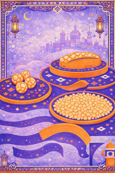
Промпт для генерации обложки
Create a highly stylized vertical illustration in a modern Arabic-inspired graphic poster style.
IMPORTANT: This is NOT a random illustration. This must feel like a designed poster system with strong composition, ornamental structure, and a cohesive visual language.
COLOR SYSTEM (STRICT): Use ONLY these colors: #CEABFE (light purple, dominant background) #FF791F (bright orange accents) #002890 (deep blue, slightly shifted toward purple tones)
High contrast, flat colors, no gradients. Soft grain texture allowed ONLY in background.
COMPOSITION (VERY IMPORTANT):
The layout must feel structured and centered, like a designed poster.
FRAME / BORDER: — thick decorative border around all edges — Arabic-inspired geometric + floral ornaments — consistent repeating pattern system — clean, symmetrical frame
BACKGROUND / ENVIRONMENT: — soft purple sky with subtle grain texture — stylized clouds — distant Arabic-style city silhouette (domes, towers) — small stars, moon, and floating decorative symbols
The background must feel atmospheric but not noisy.
- MAIN SCENE (FOOD COMPOSITION):
— three large decorative plates arranged in perspective: — left: plate with round food balls — center/front: plate filled with small grains — top/right: plate with bread or pastry
— plates must be flat, graphic, and ornamented — use patterns inside plates (stars, dots, geometric shapes)
— food must be stylized (NOT realistic): flat shapes, repeated textures, simple highlights
- FLOWING BASE SHAPE:
— under the plates, add abstract flowing ribbon-like shapes — these shapes should resemble waves or fabric — use layered purple + blue tones — integrate small decorative motifs inside
This creates motion and connects elements.
- DECORATIVE ELEMENTS:
— small stars, sparkles, geometric icons scattered lightly — 1–2 hanging lanterns near top corners (optional but subtle) — keep balance, avoid clutter
STYLE RULES:
— flat vector illustration — clean edges, bold shapes — no photorealism — no 3D rendering — no realistic lighting
— overall feel: graphic poster + packaging illustration + ornamental textile system
DETAIL CONTROL:
— avoid excessive micro-details — keep ornaments readable — maintain visual hierarchy: background < plates < decorative accents
Промпты для носителей
Промпт для генерации пакета:
Create a high-quality photorealistic product mockup of a premium paper shopping bag for a modern Arabic cafe brand. The bag is standing upright on a clean studio surface with a smooth warm gradient background (from soft red to orange), lit with soft diffused studio lighting that creates realistic shadows and subtle depth. The bag is made of thick matte paper with a slightly textured surface. It has two rope handles attached through metal eyelets, with natural curvature and soft shadows. DESIGN: The front face of the bag has a structured, framed composition using bold Arabic-inspired geometric ornament. Color palette must be strictly limited to: #CEABFE (light purple) #FF791F (bright orange) #002890 (deep blue)
The layout is divided into three main zones: TOP SECTION: A horizontal illustrated band showing stylized Arabic food: falafel balls on a plate a bowl of rice or couscous a piece of bread Illustrations must be flat, bold, geometric, and decorative, with small ornamental details and rhythmic patterns. CENTER SECTION: A large clean rectangular panel with a light neutral background. In the center, place the brand name «аполлон» in bold custom Cyrillic lettering. The typography should be rounded, geometric, slightly playful, inspired by Arabic calligraphy. Text color: bright orange (#FF791F). BOTTOM SECTION: A decorative strip with repeating geometric Arabic patterns and small framed motifs, using the same color palette. BORDER: The entire front face is framed with a thick ornamental border composed of small repeating geometric shapes and dots. SIDE PANEL: The side of the bag should also include dense ornamental patterns to reinforce the visual system. STYLE: Combination of flat vector illustration (graphics) and realistic materials (paper texture, rope handles, slight imperfections). No gradients in the graphic elements, only flat colors. Realistic lighting and subtle shadows. COMPOSITION: The bag is slightly rotated (¾ view) to show both the front and side. Centered in frame, clean product presentation. CAMERA: Eye-level or slightly above angle, natural product photography perspective. QUALITY: Ultra-detailed, high resolution, sharp focus, professional commercial mockup, realistic shadows, tactile materials. NO extra objects, NO text except the logo.
Промпт для генерации коробки
Create a high-quality photorealistic product mockup of a premium rectangular food packaging box set for a modern Arabic cafe brand. The scene shows two rigid cardboard boxes slightly offset and stacked, one in front and one behind, creating depth. The boxes are placed on a clean studio surface with a soft neutral gradient background (light gray to subtle purple tone), with soft diffused lighting and realistic shadows. The box design combines flat graphic illustration and decorative Arabic-inspired patterns. The overall color palette must be strictly limited to: CEABFE (light purple), FF791F (bright orange), and 002890 (deep blue), with possible subtle neutral tones for material realism. FRONT BOX DESIGN: The front-facing box has a structured, modular layout divided into sections. The upper area contains two square illustrated panels placed side by side: one panel shows stylized falafel balls on a plate with ornamental details the other panel shows a bowl of rice or couscous with bread Both illustrations must be flat, bold, and graphic, with geometric shapes, decorative dots, and Arabic-inspired ornament. The lower part of the box contains a wide horizontal band with a clean background where the brand name «аполлон» is placed in bold custom Cyrillic lettering. The text should be centered and colored in bright orange (#FF791F), with smooth, rounded, geometric letterforms inspired by Arabic calligraphy. Along the bottom edge of the box, include a decorative horizontal border strip with repeating geometric Arabic patterns using the same color palette. SIDE AND BACK BOX: The second box behind should be slightly rotated or offset, showing the side panel with dense ornamental patterns and decorative framing, reinforcing the brand system. STYLE: Flat vector illustration for food elements combined with realistic packaging materials (matte cardboard texture, subtle grain, soft edges). No gradients in illustration elements, but soft lighting and shading on the physical box. COMPOSITION: Centered product shot, clean and balanced, with slight perspective. Boxes should feel premium, tactile, and well-designed. No clutter, no additional objects. CAMERA: Front-facing with slight angle to reveal depth between the two boxes. QUALITY: Ultra-detailed, high resolution, sharp edges, professional commercial mockup, reali
Промпт для генерации меню:
Create a high-quality realistic mockup of a stylized restaurant menu being held in hands.
I will attach reference images: — Reference 1: hand-held menu photo (composition, lighting, camera angle) — Reference 2–4: brand identity (style, colors, ornaments, illustration style)
PART 1 — MOCKUP (REALISTIC PHOTO):
Recreate the composition of Reference 1: — close-up shot of a man holding a clipboard menu — natural hands, realistic skin texture — striped shirt visible in background — slightly angled perspective — soft flash photography look — realistic shadows and depth
Replace the original menu in his hands with a NEW custom menu (described below).
The menu must be clipped into the clipboard naturally (realistic perspective, no distortion).
PART 2 — MENU DESIGN (INSIDE THE MOCKUP):
Create a decorative, sticker-shaped menu (NOT rectangular): — organic rounded silhouette — arabesque ornamental border — inspired by Middle Eastern design
STYLE (from references 2–4): — dominant colors: purple, blue, warm orange — flat decorative illustrations — minimal realism, graphic style — soft grain texture — no green dominant colors
TYPOGRAPHY (CRITICAL):
— ALL text in ONE centered vertical column — perfectly center-aligned — small, аккуратная, плотная типографика — consistent spacing between lines — no columns, no left/right splits — no UI blocks or labels
Text must look like a clean vertical list from top to bottom.
CONTENT (RUSSIAN, REAL DISHES ONLY):
ГОРЯЧЕЕ Шиш-таук — 430 ₽ Кебаб — 450 ₽
СЭНДВИЧИ Шаурма — 350 ₽ Фалафель в пите — 300 ₽
ЗАКУСКИ Хумус — 250 ₽ Бабагануш — 260 ₽ Табуле — 240 ₽ Фаттуш — 240 ₽
СОУСЫ Тахини — 90 ₽ Чесночный соус — 90 ₽
STRICT REMOVALS:
— NO beverages section — NO drinks text — NO drink illustrations — REMOVE any salad imagery (no green dishes) — NO random Arabic text — NO stars, cosmic or space elements — NO inconsistent font sizes
LAYOUT DETAILS:
— logo at top, centered — menu text strictly in center — decorative illustrations placed ONLY around edges — illustrations must frame the menu, not interfere with text
FINAL RESULT:
— must look like a professional brand identity presentation — clean, balanced, highly aesthetic — believable real-life mockup + strong graphic design — no AI artifacts, no chaotic composition
Промпт для генерации стикеров:
Create a high-quality realistic product mockup of a transparent resealable zip-lock plastic bag.
IMPORTANT: The plastic bag must be fully transparent (no beige background), with visible light reflections, soft wrinkles, and realistic material thickness. The bag should look like a retail packaging mockup, photographed in a studio environment. Use soft neutral lighting and a light gray or off-white background.
INSIDE THE BAG: Place three overlapping round stickers, slightly scattered and not perfectly aligned. Stickers should look like printed matte vinyl with subtle texture and a thin white cut contour.
STICKER STYLE: Use bold, flat, graphic illustrations inspired by modern Arabic ornamental design. Color palette must be strictly limited to: CEABFE (light purple), FF791F (bright orange), 002890 (deep blue). Include geometric decorative patterns, dots, and rhythmic ornament elements. Each sticker should have a circular frame with decorative borders.
STICKER CONTENT: One sticker with falafel balls on a plate with ornamental background One sticker with a bowl of rice or couscous with bread One sticker with a stylized Arabic lantern
COMPOSITION: The stickers should overlap slightly to create depth. Keep them centered inside the bag but with a natural, slightly messy arrangement. Maintain good balance and visual hierarchy.
BAG DESIGN: Add a decorative printed border on the plastic bag using the same color palette and Arabic-inspired patterns. The border should frame the bag on all sides.
STYLE REQUIREMENTS: Combination of flat vector illustration (stickers) + photorealistic packaging (bag) Clean, sharp, high resolution No extra objects in the scene No text
CAMERA: Front-facing view (slight top-down angle allowed) Product-centered composition
QUALITY: Ultra-detailed, high resolution, professional product mockup, realistic shadows and highlights
Промпт для коробок с едой:
Create a high-quality photorealistic product composition for a modern Arabic-inspired cafe brand, featuring a still life arrangement of branded packaging and food. The scene includes several stacked matte cardboard boxes with clean edges, each decorated with geometric Arabic-inspired ornaments and the Cyrillic logo «аполлон» in bold rounded lettering. In front of and on top of the boxes are plates and containers with food: falafel balls on a decorative plate, a bowl filled with small round snacks or couscous, and a paper cup filled with fried bites. The objects should be arranged in a balanced, slightly asymmetrical composition with visible depth.
Use a soft studio lighting setup with warm highlights and gentle shadows, creating a premium commercial look. The background should be a smooth textured surface in light purple tones, matching the brand atmosphere. Add a subtle ornamental frame around the edges of the image, using repeating Arabic geometric patterns.
Color palette should be dominated by CEABFE (light purple), FF791F (bright orange), and 002890 (deep blue), with slight natural variations for realism. The packaging should feel tactile with soft paper texture, while the food remains slightly more detailed and appetizing.
Camera angle should be slightly above eye level with a soft perspective, focusing on clarity, sharpness, and material contrast. No extra objects, no clutter, clean professional food branding mockup.
Промпт для генерации бумажных стаканчиков:
Using the previously generated napkin design as the base visual system, create a branded paper cup mockup in the exact same style. GOAL: Translate the existing pattern system from the napkins into a paper cup design while keeping full brand consistency. CONSISTENCY (VERY IMPORTANT): — use the SAME pattern logic (grid, ornaments, repetition) — use the SAME visual language (flat vector, bold shapes) — use the SAME color palette: CEABFE, FF791F, 002890 — pattern must clearly feel like part of the same brand system ADAPTATION TO CUP: — wrap the pattern naturally around the cylindrical surface — adjust scale so the pattern fits the cup proportions — allow partial cropping of pattern elements due to curvature — keep rhythm and modular structure visible CUP MOCKUP: — realistic paper coffee cup — matte paper texture — soft natural lighting and shadows — include lid (white or neutral) — minimal clean background — show 1–2 cups (front view or slight angle) STYLE: — graphic, ornamental, modular — no gradients, no realism inside the pattern — pattern stays flat, only the mockup is realistic IMPORTANT: — do NOT redesign the pattern from scratch — do NOT change colors — do NOT add new random elements — this is a direct extension of the existing system OUTPUT: high-quality realistic mockup of a branded paper cup that clearly belongs to the same visual identity as the napkins
Промпт для генерации бумажных салфеток:
GOAL: Create a realistic mockup of printed napkins (paper napkins) using a patterned design. PATTERN SYSTEM (VERY IMPORTANT): — build a modular repeating pattern based on a grid — use horizontal and vertical pattern blocks — combine stripes, checkerboards, ornaments, and geometric motifs — pattern should feel structured and rhythmic, not random — clear repetition logic like a textile or tile system VISUAL STYLE (CRITICAL): — strictly follow the style of the second image — flat vector graphics — bold shapes, no gradients — decorative food-inspired ornaments and geometric motifs — use ONLY these colors: CEABFE, FF791F, 002890- high contrast, clean edges NAPKIN MOCKUP: — realistic paper napkins (square format) — slightly folded or stacked napkins — visible paper texture — soft natural shadows — clean minimal background — show multiple napkins (stack or spread) COMPOSITION: — pattern must be clearly visible on the napkins — avoid distortion of the pattern logic — show how the pattern wraps across folds STYLE KEYWORDS: graphic, ornamental, modular, textile-inspired, bold, contemporary branding IMPORTANT: — do NOT make it look like a poster — do NOT add logos or text — focus on pattern + material + presentation OUTPUT: high-quality realistic mockup of branded napkins with a consistent modular pattern system


