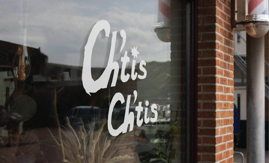
The brand positioning
Ch’tis Ch’tis is a restaurant serving northern French cuisine, based on the French comedy «Welcome to the Sticks», which combines authentic regional French culture with youthful energy, an active lifestyle, and open urban events.
The brand is positioned as friendly, lively, delicious, and socially engaged — a place where the barriers between «outsiders» and «insiders» are broken down.
One of the brand’s core values is generosity. That’s why they always serve large portions, crusty bread, and hearty dishes that warm both the soul and the body. The restaurant also stands out for its service. Guests feel like they are spending time with old friends. Servers and even the chef may come out to join the guests, joke around, and explain the history of the dishes. There is no snobbery here, only a sincere desire to make you feel at home, even if that home is in «Berge».
«On n’est pas bien là?» — «Isn’t this a nice place?»
This is the brand’s bright slogan, reflecting its love for its native land.
The narrative promise
The restaurant promises not only to satisfy your hunger, but also to make strangers feel at home through a shared meal. It conveys a sense of acceptance, warmth, and joy from simple things.
Here, you can escape the hustle and bustle of the capital and leave your prejudices behind. Like Philip, who feared the «terrible north» but found friends and happiness there, restaurant guests come for a hearty lunch and leave with the feeling that they have been understood and welcomed. The restaurant serves as a space for genuine human interaction, where status and table manners are not important, but rather a willingness to share a meal, laughter, and stories. It celebrates regional identity, local products, and the culture of «ordinary people, ” showing that true value and depth are often hidden behind first impressions.
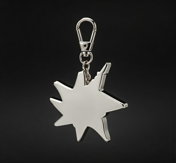
Logo
Smooth, shiny, perfect Michelin stars are a symbol of the highest, often inaccessible and strict gastronomic Olympus. The star on the logo, with all its irregularities, is its complete opposite. It says: «We have our own star. It’s not from a guidebook, it’s from the heart.»
Graphic universe
The bright colors in the identity are a strategic response to the main stereotype about the North, which the film plays on. If in the mass consciousness the North is a gray, damp, and dreary place, then the restaurant becomes its visual antithesis and emotional truth.
moodboard
color palette
principle of creating a pattern
typography
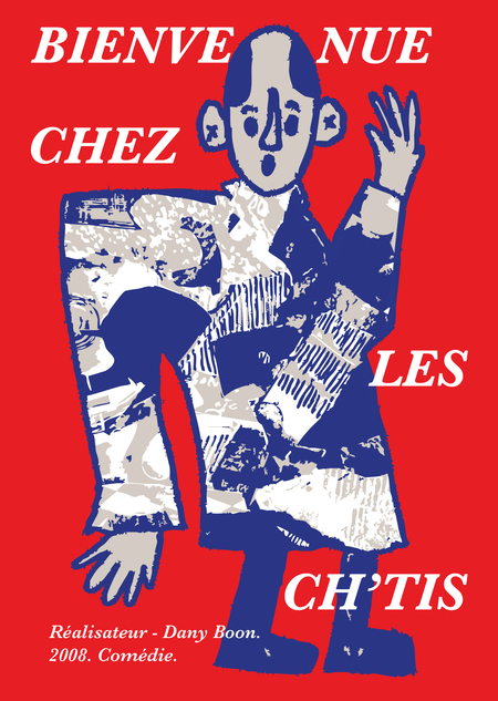
Rebranded film cover
The poster depicts the main character of the film. Bright and «one of us.»
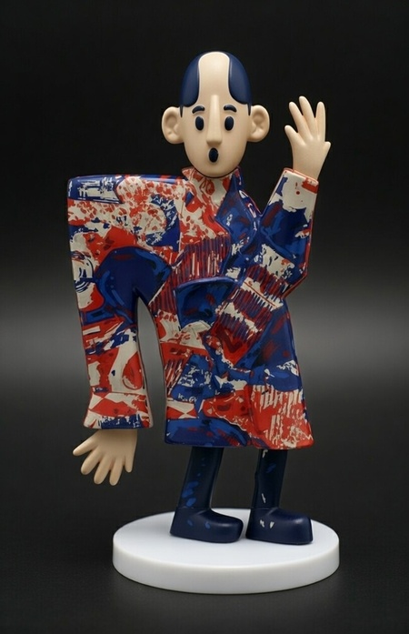
Merchandising
tea set
crispy freshly baked bread
t-shirt
lunch box
generated using grok.com
Social media content
promotional trailer
аnimated using grok.com and After Effects


