Origin
'Vodnik' was born in the intersection of breakage and fragility. Floor tiles are the foundation on which man walks every day, but as soon as they are separated from the floor and take a different position, they can easily break.
Main Hall and Corridor (Vodnik Cultural Center)
As inspiration I chose mosaic tiles from the abandoned Vodnik Community Center in Saint-Petersburg (Russia). Back in past it was a pompous and ceremonial building that could accommodate thousands of people. Now dilapidated, the building, in its authentic state, has become a haven for artists and nonconformists. Alternative exhibitions and punk rock concerts are regularly held there. Most of them illegally.
Broken tiles (Vodnik Cultural Center)
The font interprets breakdowns not as a malfunction, a decommissioned product, or something that needs to be fixed,
but as a sign of vulnerability.
Visit Card
Font case
Latin font case
Cyrillic Font Case (additional)
Character architecture
Stroke weight swings from heavy to hairline inside a single letter. It reads as deliberate rather than sloppy — the kind of awkward that only holds together when it’s drawn on purpose.
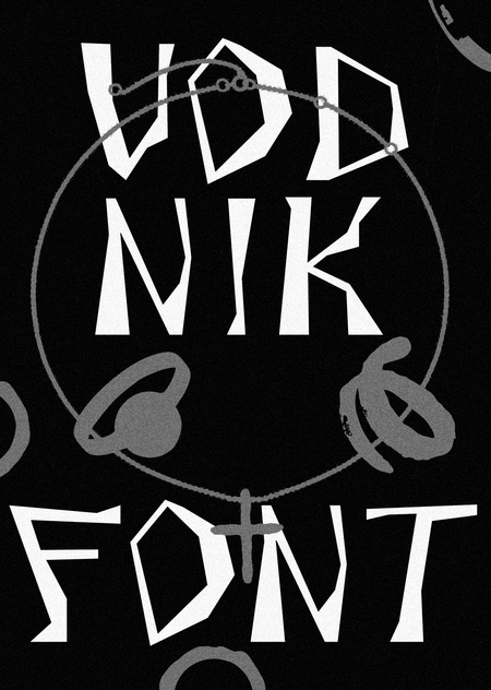
Set it large. Vodnik is built for the headline, the title, the one word that has to stop someone in a hallway.
Font in use
Stickers


