Film Selection
Piter FM is a story about a lost phone, a radio DJ, and an architect. It’s about how a tiny delay (0.5 seconds) or a random accident can change who you meet and where you go.
Project adaptation
ZEROFIVE turns this «meaningful accident» into a discovery app for Paris. In a city where everyone is on autopilot following Google Maps, ZEROFIVE pushes you to take the detour to discover new places, people
The Brand
Vision
Breaking the «Metro-Boulot-Dodo» We are the anti-habit tool. In a city optimized for speed, we de-optimize for experience. Our vision is to transform the daily commute from a «dead time» into a narrative journey, turning urban zombies back into explorers.
Values
Spontaneity: We celebrate the «wrong turn.» An error is simply an unmapped opportunity.
Urban Exploration: Inspired by the Dérive (drifting). We prioritize the «vibe» (sound, light, texture) over the algorithm’s rating.
Real Connection: No swiping. We facilitate encounters based on shared timing and shared space.
Brand Promises
Catching the «Almosts» «We find the spots and people you’d usually miss by 0.5 seconds.» We act as a synchronicity engine. We align your path with the hidden signals of Paris, ensuring you don’t miss the life-changing moments that routine usually hides.
Signature
Follow the signal. A direct call to tune out the autopilot and tune in to the city’s broadcast.
App Concept
ZEROFIVE doesn’t find the fastest way; it finds the right way. We use an intentional signals algorithm to break your daily routine. By adding 0.5 seconds of hesitation to your commute, we open doors to new places and spontaneous human connections. It’s not about getting there; it’s about what happens because you got lost.
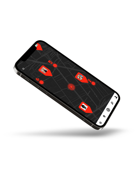
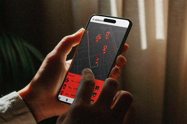
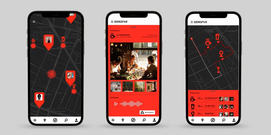
How it works
The Input: You enter your destination (e.g., «Home») and how much extra time you have (e.g., «20 minutes»).
The Glitch: Instead of a blue line, the app finds detours for your route. It pulls you off the main boulevard and into side streets, guided by «Signals» (ambient audio, community vibes, and locations.)
The Sync: If another user’s detour crosses yours at the same time, the app alerts you. You have 0.5 seconds to decide to «Sync» and meet for a coffee or a walk, removing the pressure of traditional dating apps.
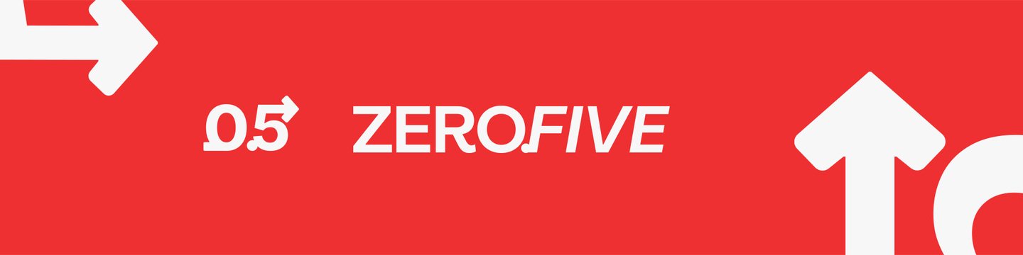
Logotype
The logo uses Alecrim a Brutalist Sans-Serif font for the word ZERO, anchoring the brand in the physical weight of the city. The shift to Italics on FIVE creates an immediate visual break. It represents the tilt which is the exact moment when routine deviates and the drift begins.
Logo
The logo features a custom numerical 0.5 icon, where a fluid arrow originates at the zero and terminates atop the five. This symbol represents the trajectory of chance, visualizing the intentional glitch and the non-linear detours that define the brand. By physically bridging the numbers, the arrow also symbolizes the Sync acting as a graphic reminder that ZEROFIVE connects digital signals to physical human encounters, transforming a standard coordinate into a spontaneous story.
Typography
The brand uses Alecrim for its unique duality, which perfectly mirrors the «Human Brutalism» theme. It provides a minimalist, sans-serif foundation with high-contrast cuts that feel industrial and architectural, matching the stability of the city. However, unlike traditional cold fonts, Alecrim contains subtle curves and open terminals that bring a sense of human warmth. This combination allows the brand to remain structurally rigid enough for an architect while staying inviting enough for a personal conversation.
Color Palette
The palette is a dialogue between the rigid city and the human presence within it. Slate and Charcoal represent the cold, brutalist shell of Paris, the concrete, the shadows of the metro, and the structural blueprints of the urban landscape. This is disrupted by Signal Red, a dominant accent inspired by the protagonist’s red jacket in the film.
System icons
The system icons are designed to function as technical landmarks within the ZEROFIVE interface. Following a bold and brutalist style, they utilize thick, unrefined strokes and sharp geometric angles that prioritize raw functionality over decorative elegance. This industrial aesthetic reinforces the app’s identity as a «field tool» for urban exploration, providing a high-contrast visual language that remains legible and authoritative against the grainy, atmospheric backdrop of the city.
Social Media
The social media campaign expands on this narrative by focusing on the serendipity of lost objects.”Each post illustrates how losing a personal item a shoe, a key, or a phone serves as the catalyst for a new urban adventure, directly referencing the core philosophy of the film. These posts bridge the gap between digital interaction and physical discovery, consistently ending with the brand’s call to action: Follow the signal.
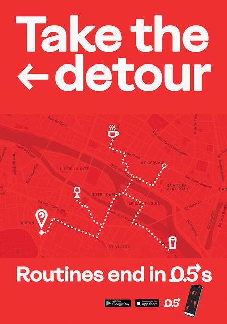
Poster
The poster employs a minimalist layout inspired by Paris Metro construction notices, reframing the «detour» from an inconvenience into an invitation. Featuring a simplified urban map of hand-picked spots for wine and coffee, it uses bold Alecrim typography to deliver the call to action: «Take the detour.» This encourages immediate exploration of the city’s hidden layers, grounded by the slogan «Routines end in 0.5s» and the ZEROFIVE logo.


