Amélie Brûlée is a bakery brand in St. Petersburg, inspired by the philosophy of small joys and quiet care expressed in the film Amélie
It is a pause within the rhythm of the big city, where dessert becomes a way to slow down, notice simple wonders, and briefly return to oneself
Twenty-five years after the release of Amélie, the world has become even faster — we tend to celebrate only big milestones, while happiness lives in small details that we need to relearn how to notice. In an era where success is measured by promotions and vacations, we have forgotten how to find joy in a random Tuesday at 3:47 pm.
The project does not directly quote the film, but reinterprets its emotional tone, transforming it into a bakery brand for the Russian context while maintaining a dialogue with French aesthetics
My goal is to preserve the balance between the postcard-like Paris of the film and the everyday reality of St. Petersburg, without excessive stylization or caricature.
The target audience is urban dwellers aged 25–35, tired of the city’s noise and seeking personal «rituals of happiness.» They are drawn to French aesthetics, but what matters most is a sense of coziness, calm, and authenticity.
The Amélie Brûlée brand is built around a visual language that could have been created by Amélie herself — with notes of subtle oddness, naïveté, and sincerity. It is lively, light, and inspiring, just like the film itself
The logo is a dense typographic mark with reverse contrast and a printed texture, inspired by the dialogue between French shop signs from the 1930s–40s and Soviet typography.
Amélie’s impulsiveness, spontaneity, and sensitivity are expressed through the variable placement of the descriptor. This is not literal chaos, but subtle shifts that bring the identity to life and reflect the heroine’s character.
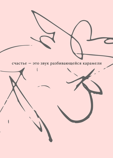
Watching the film inspired a series of illustrations — slightly abstract and quick, as if drawn by Amélie herself. They can be divided into impressionistic pieces, conveying sensations, sounds, or textures, and more representational works that reflect scenes from the film or evoke closely related associations.
The color palette is built around associative colors inspired by the film and the image of France:
Le Rouge d’Amélie — the heroine’s signature red: impulse, bold gestures, small acts of happiness. Rêve de Paris — dreamy pink Parisian sunsets, falling in love with the city. Montmartre Mist — calm grey-blue of misty mornings, balance and quiet coziness. Beurre Chaud — warm tones of croissants and butter, care and café mornings. Parisian Stone — neutral grey of stone and old walls, urban stability.
Small joys, every day
This short slogan captures the essence of the brand: it is not about events, but a state of being. A space where happiness can be found in the little things — for example, in the sound of caramel breaking
Our values are attention to life’s small pleasures, warmth, and the courage to be oneself
Abstract illustrations that convey mood are used in posters to express sensations, smells, and sounds
Visual balance is achieved by combining a clear, easy-to-read logo with these light, expressive illustrations in varying sizes
The logo is always centered, poster headlines are aligned to the bottom edge, and technical information is placed in a strip at the bottom of the poster.
Illustrations vary in size, text is rotated, and elements appear «out of place» — not as chaos, but as a reflection of liveliness.
When posters focus on more specific stories and scenes, the illustrations become more representational and less abstract
The menu consists of several cards for selecting drinks and desserts. Guests can mark their choices with a check, a cross, or any symbol they wish. The menu items are inspired by the film.
Illustrations can become standalone motifs on tableware
Two types of coasters were designed for the café: the first features questions with space for answers, encouraging conversation while waiting for an order, and the second showcases the brand’s signature illustrations.
Classic French patterns are used for product packaging and coasters: stripes inspired by Parisian café awnings and polka dots. They evoke nostalgia without caricature, capturing the mood and charm of Paris.
Social media icon — a hand-drawn monogram, light and imperfect, as if sketched by the heroine herself.]
The photo style is inspired by Jean-Pierre Jeunet’s visual language in Amélie: overhead compositions referencing the iconic crème brûlée scene. Images are slightly lightened in post-production to create a soft, balanced, and airy mood.


