
For me, Jean-Pierre Jeunet’s «Amélie» is a cinematic hymn to visual poetry, where every frame becomes an emotion, a metaphor, or the main character’s hidden thought. The film creates its own magical world through a unique visual language.
The film’s most distinctive feature is its exaggerated color palette. The dominant, rich greens, tawny, and deep reds create a warm, almost fairytale-like atmosphere. This isn’t the real Paris, but the Paris of Amélie’s inner worldcozy, vibrant, and emotionally charged.
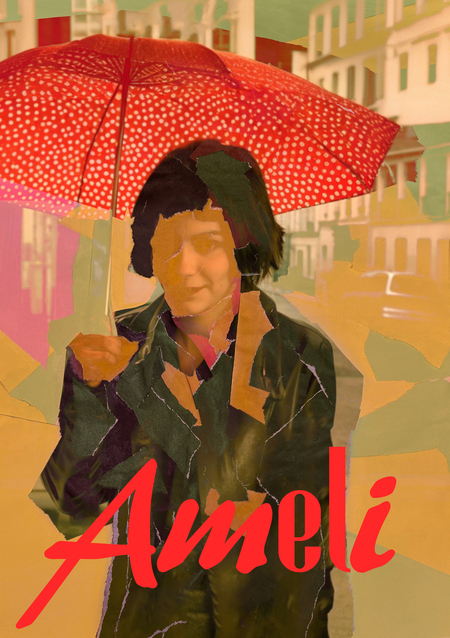
In my work, I didn’t want to remake «Amélie» to suit my vision, nor did I want to invent anything of my own. Everything beautiful had already been created by the creators. My task was simply to transfer «Amélie» from the film to real life, to give it a tangible, but not flat, boring, or recycled look. I thought about what Amélie would do in my place, and she gave me some advice.
I realized the key to the solution was combination. All the beauty was already in my hands. The credits already had the fonts I needed, which I used to create the logo, and the primary and secondary colors for the frames had already been chosen.
In the film, the main character was busy connecting lonely people, restoring their memories, and helping them find happiness.
But the biggest and most interesting mystery for Amelie was the torn photographs. I thought this could be a great idea for my design. I took some colored paper, tore it up, and started laying out the pictures. Then I combined them with the film stills.


